Brought to you by Scott P. Rogers, Funkhouser Real Estate Group, 540-578-0102, scott@HarrisonburgHousingToday.com
Brought to you by Scott P. Rogers, Funkhouser Real Estate Group, 540-578-0102, scott@HarrisonburgHousingToday.com
Friday, June 20, 2008
I recently posted a six year trend graph of median home prices, measured each quarter, and concluded that median home sales price analysis is not wildly significant.
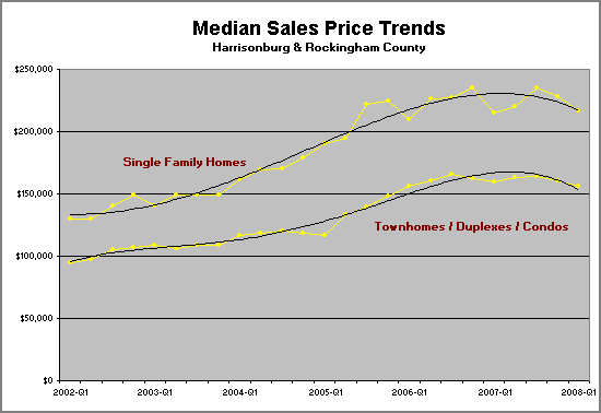
However, several people mentioned to me that they would be interested to see how the trend lines changed if I broke out single family homes, as compared to townhomes/duplexes/condos. Here's what we get...

As you can see, the trend lines aren't wildly different than the trend line that included both data sets together.
Also, both trend lines seem to indicate an increase in median sales price. This could either mean that:
However, several people mentioned to me that they would be interested to see how the trend lines changed if I broke out single family homes, as compared to townhomes/duplexes/condos. Here's what we get...

As you can see, the trend lines aren't wildly different than the trend line that included both data sets together.
Also, both trend lines seem to indicate an increase in median sales price. This could either mean that:
- Home values are declining in Harrisonburg and Rockingham County, or
- Less expensive homes are selling more often these days than more expensive homes.
