Brought to you by Scott P. Rogers, Funkhouser Real Estate Group, 540-578-0102, scott@HarrisonburgHousingToday.com
Brought to you by Scott P. Rogers, Funkhouser Real Estate Group, 540-578-0102, scott@HarrisonburgHousingToday.com
Monday, January 26, 2009
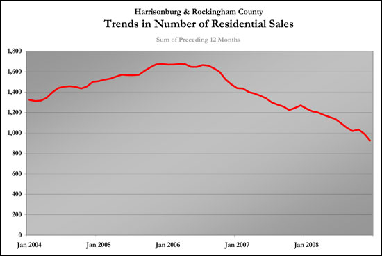
Below is one of the graphs I generate each month in my monthly market report. This graph shows an overall trend for residential sales in Harrisonburg and Rockingham County by computing the rolling sum of the previous twelve months of market activity.
To explain a bit more clearly, here are a few examples:
To go a bit futher, I broke down the data between different sizes of homes (0-1499 SF, 1500-2499 SF, 2500+ SF). This can show us trends in how each size of home is selling, and it will be interesting to see when each of the individual trendlines turns positive, and when the collective trendline turns positive.
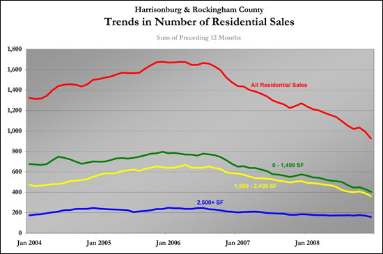
The graph above shows all residential sales, and then shows each of the other size ranges of homes (0-1499 SF in green, 1500-2499 SF in yellow, 2500+ in blue).
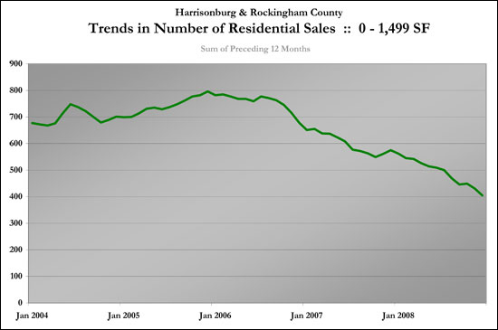
This graph shows the trendline for homes (single family and townhomes) with less than 1500 square feet. With a somewhat smaller data set we see more volatility in this trendline, even with rolling twelve month sums, but it can still give us a good idea of long term trends in this type of housing.
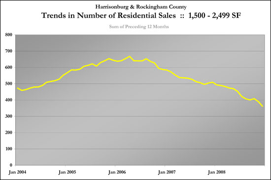
The graph above shows the changes in sales activity for mid-range homes (1500-2499 SF). This trendline doesn't have as much volatility, and mimicks more closely the overall trendline.
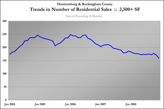
This graph shows the trendline for larger homes, with at least 2500 square feet. There was a good bit of volatility in this trendline during 2003 and 2004, but it has now returned to a trendline much more similar to the overall market trend.
To explain a bit more clearly, here are a few examples:
- The December 2008 data point on this graph is the sum of January 2008 - December 2008.
- The November 2008 data point is the sum of December 2007 - November 2008.
- This metric is comparing 12 month periods to 12 month periods, instead of just comparing a month at a time or a quarter at a time.
- Every data point on this metric accounts for all months and seasons of the year, since it is always summing up a 12 month period.

To go a bit futher, I broke down the data between different sizes of homes (0-1499 SF, 1500-2499 SF, 2500+ SF). This can show us trends in how each size of home is selling, and it will be interesting to see when each of the individual trendlines turns positive, and when the collective trendline turns positive.

The graph above shows all residential sales, and then shows each of the other size ranges of homes (0-1499 SF in green, 1500-2499 SF in yellow, 2500+ in blue).

This graph shows the trendline for homes (single family and townhomes) with less than 1500 square feet. With a somewhat smaller data set we see more volatility in this trendline, even with rolling twelve month sums, but it can still give us a good idea of long term trends in this type of housing.

The graph above shows the changes in sales activity for mid-range homes (1500-2499 SF). This trendline doesn't have as much volatility, and mimicks more closely the overall trendline.

This graph shows the trendline for larger homes, with at least 2500 square feet. There was a good bit of volatility in this trendline during 2003 and 2004, but it has now returned to a trendline much more similar to the overall market trend.
